
Ron Bertino Portfolio Investing, Get steady and consistent returns with low drawdowns, spending just 20 mins per month.

Sure. Doesn’t everybody?
The problem is that we’re led to believe that investing our own money is too risky and we should therefore use hedge funds in order to take care of our long term investments.
Financial concepts tend to sound quite complicated and involve either having to get deep into the weeds with complicated financial formulas, or resorting to having to become a programmer in order to code up even a simple investment strategy.
That may sound like a crazy question to ask, but did you know that the average yearly returns of hedge funds are just 4.5% to 5% over the long term? They may be higher in more recent years, where the stock market has been increasing at an incredible rate, but once you include a few stock market crashes, then the yearly returns drop to an average of around 5%.
That’s a performance statistic which tracks 600 to 800 of the larger hedge funds, where each of these hedge funds need to have at least 100 million dollars of customer funds under management.
While you may be frustrated with that level of lackluster performance, the hedge funds are still perfectly happy to keep charging you their management fee, no matter how they perform.
While the average hedge fund performance has been lackluster, there are certain hedge funds that do perform very well. Ray Dalio runs one of the largest hedge funds in the world, called Bridgewater Associates, which as of 2018 manages over 125 billion in customer funds. Ray Dalio himself is a billionaire. So when a person like this makes a statement about having found the Holy Grail, then perhaps we should pay attention.
Here is a short 4 min video, where Ray Dalio explains the concept of the Holy Grail. Note that he’ll reference a bunch of terms that you may be unfamiliar with (standard deviation, correlation, alpha, information ratio, etc). Don’t worry, by the time you complete this course, you’ll know and fully understand all of these financial terms.
The main point he’s making is that the Holy Grail can be achieved by trading a variety of trading strategies or portfolios, where the return of each of these portfolios is unrelated to the others. When one strategy or portfolio is losing money, then hopefully the others aren’t losing money at the same time.
The keys are to:
a) have a variety of different portfolio strategies to choose from
b) be able to measure the degree of correlation between these strategies
You’ll be learning both of the above in this course.
I remember back in 2008 and 2009, during the financial crisis, where I was working for a large IT consulting firm.
I had a bunch of money in a 401K retirement account, and the only way we could “manage” the funds was to choose from a variety of portfolios that they had put together.
At the time, I did what pretty much everyone does, which is to just pick a few of the funds that appeared to perform the best and had relatively small historical drawdowns.
Well, during the 2008/2009 period, my entire 401K retirement account was down by around 45%. Where was the diversification that they claimed to offer in order to protect the portfolio from this huge drawdown?
It was quite painful to watch, yet the fund managers of these accounts still ended up taking their management fee.
The red line represents the returns of the S&P 500, which is an index of the 500 largest companies in the USA. This is what most people tend to refer to when they talk about the “stock market”.
The blue line represents the returns of one of the dozen or so portfolio examples we’ll cover in the course.
Do you want wild and crazy (red line) or steady returns with low drawdowns (blue line)?
Now look at the difference between these two when it comes to the drawdowns experienced over the long term.
Notice how during the 2000-2002 time period, when we had the DotCom crash, the market (red line) was down 45% while this sample portfolio (blue line) barely felt any pain at all with a drawdown of around 5%.
During the financial crisis in 2008-2009, you can see that the stock market went down by 50%, yet this example portfolio was only down by just 14.5%.
Would you be willing to have your return go from 9.56% per year down to 8% per year, if it meant that you could cut your drawdowns from 50% down to 15%?
If your answer is yes, then that’s exactly the kind of thing you’ll be learning in the course.
You should also take note of the consistency of the returns of the blue line.
Look at the returns between the year 2000 and 2013. Notice how the red line went down, then up, then down and then up. That was a drawdown that lasted 13 years! Now compare that to the consistency of the blue line during the same period, or any other period during the backtest.
Here is a zoomed in view, showing the performance over that 13 year period. Note how the stock market (red line) gave us a return of just 1.56% during that 13 year period, whereas the diversified portfolio gave us a consistent 8% yearly return.
Last but not least, remember what Ray Dalio mentioned in the video above. Our objective is not to find the one “perfect” portfolio. Our objective is to find a variety of different portfolios, which are relatively uncorrelated (the returns and drawdowns of each portfolio tend to not happen at the same time), and trade them together.
In this course we’re going to cover a dozen or so ready-made portfolios that you could potentially start using immediately.
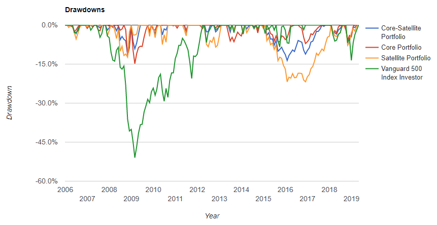
Here’s a second example. Let’s compare one of the “core-satellite” portfolios we cover in the course (blue line) verses the stock market (green line). You can ignore the other colored lines.
Our core-satellite portfolio is giving us a yearly compounded return of 11.91% versus the stock market at 8.78%, and we see a max drawdown of 13.63% with our portfolio versus the stock market having a max drawdown of 51%.
Here are the drawdowns:
As you saw in the Ray Dalio video from above, the ideal situation is to trade a bunch of uncorrelated portfolios together.
Since the profits and losses of the different portfolios will come at different times, this will result in smoother overall returns.
Here are the cumulative returns of a sample of 9 different portfolios that you’ll learn when you complete the course. There is no subscription cost involved nor any extra purchases you need to make in order to learn these 9 portfolios. It’s all contained within the course and the private forums for the course.
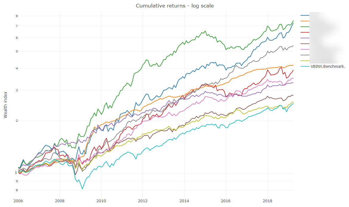
The cyan colored line at the very bottom (worst performing) is what the industry tends to use as a benchmark. This is the equivalent of investing 60% of your money into the main stock market and 40% into bonds.
You’ll find that the majority of hedge funds are unable to beat the performance of this 60% stocks 40% bonds split. Yet, you can see above that you’ll learn to trade multiple portfolios which have easily beaten this benchmark in the past, especially when you include stock market crashes.
Here are the drawdowns of these 9 portfolios.
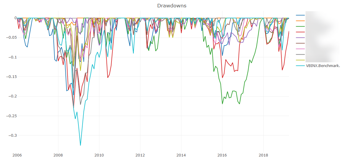
Recall that the stock market crashed by -50% during the 2008/2009 period. The benchmark of 60% stocks and 40% bonds did better, since it drew down by -32%.
You can see that the majority of the 9 portfolios you’ll learn about within the course drew down far less. Most drew down by around -10%, and the more aggressive portfolios drew down by on -20%, at times when the stock market was down by -50%.
If you were to do nothing other than invest equally into all 9 of these portfolios, then your equity curve would look like the following.
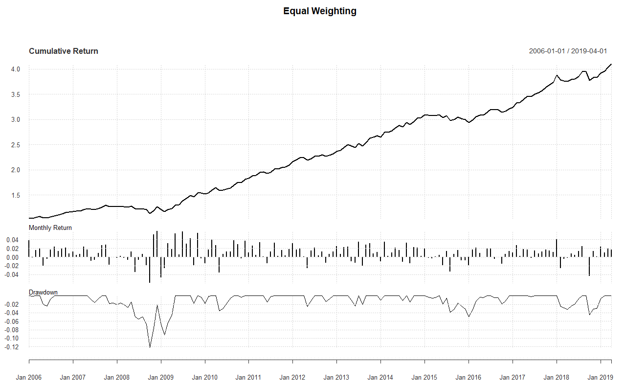
Even during the 2008/2009 crash, when the stock market was down by -50%, this equal weighted portfolio was down only -12%. Notice what a smooth and steady ride you get.
Every $1 you invested at the start of 2006 has grown to over $4 by the start of 2019. That’s 400% growth in 13 years, all while experiencing a max drawdown of just -12%. Pretty darn good!
While this course has roughly 12 hours of video content (with an extra couple of hours being added in the next few weeks), it’s only natural that you should be curious as to whether you’ll be able to extract value out of it, especially if you haven’t seen me do presentations in the past.
In order to put that concern to rest, I’m going to make available one of the early modules from the course.
This is a video that explains many of the ways that you can be tricked by trying to interpret performance data.
This is not some little 4 minute video giving you a tiny sneak peak. This is one hour and 18 mins of content for you to review. It’s an entire module from the main course.
If you’re interested in finance, you’ve likely flipped through a book on investing or perhaps checked out some blogs about portfolio management, but found it all a bit too complicated.
Variance, standard deviation, co-variance, beta, correlation, Sharpe ratio, Martin ratio, Value at risk, efficient frontier, risk parity, etc. The list goes on an on, and nobody is clearly explaining what these things are in simple terms that a normal human can understand.
This is a big reason as to why most people end up finding it all too difficult and then just give their money to mutual funds or hedge funds, and then resort to just crossing their fingers hoping that they haven’t made a terrible mistake.
The main aim of this course is to explain all of those technical financial terms in a way that is simple and easy to understand.
Many of the concepts are explained visually, and we focus on understanding the core idea without getting deep into the weeds.
We focus on things that are practical, and are later applied onto the analysis of real portfolios.
We will build some spreadsheets together, step by step, in order to make sure that the concepts and calculations are fully understood and internalized.
We’ll make use of some extremely powerful and functional online tools that can automate much of the portfolio analysis, and all without needing to write a single line of code.
In the course we’ll cover around a dozen or so pre-made portfolios that you can start off with. Additional portfolios and trading strategy ideas will be added over time, as our community continues to grow and share ideas.
Introduction
Returns
Measuring risk
Factor models
Permanent portfolios
Moving average filters
Modern Portfolio Theory
Dual Momentum
Other portfolios
We will jointly construct spreadsheets that reinforce the concepts presented in the course, using the free Google Sheets technology.
Stock analysis spreadsheet
We will:
(Don’t worry if all of the above terms sound complicated to you right now. By the end of the course, you’re going to be crystal clear on what they mean and how they work)
Conversion spreadsheets
The first spreadsheet will take output from one of the online portfolio backtesting tools we will use, and then convert the output into a clean time series, which we can then analyze in more detail.
The second spreadsheet will do something very similar, but will take calendar style returns as the input and then convert it into a clean time series for further analysis.
Comparison spreadsheet
This spreadsheet will take the log returns of the clean time series data we have now created, and will show the results of two different portfolios side by side, together with stats comparing the two.
Google Apps Script automation code
One of the aims of this course is to present everything without getting into any programming code.
That said, I have created some Google Apps Script automation code which will greatly assist with some of the above steps, in terms of the conversion and comparison spreadsheets I’ve mentioned above.
I do not get into explaining any of the Google Apps Script code within the course, but I do make the source code fully available, for anyone who wishes to use it as a reference for their own spreadsheet automation work.
If you don’t trade broken wing or standard options butterflies, feel free to completely skip over this section.
If you do trade options flys, then you may have come to realize that the right wing of the put fly (debit) tends to almost neutralize the credit from the left wing of the fly.
This tends to leave a fairly significant amount of “cash” in your trading account, even though you may be fully utilizing the account for your options trading.
That “cash” can potentially be used in order to buy conservative ETF portfolios.
Let’s say that your options trading is going along really well, and you’re making a 20% return per year.
After going through this course, you could then consider applying your new knowledge in order to buy some ETF portfolios with that “unused cash”, and aim to extract an additional yearly return of perhaps 6% to 10%, with a conservative portfolio which has historically shown to draw down by just 10% over the past 50 years.
Even a 6% bump on your existing 20% return from your options trading is quite a significant improvement, and this is done by using your “unused cash”.
In just a few hours you’ll be able to learn and understand many of the financial concepts which have been preventing you from confidently controlling your own investments. You’ll have access to a dozen or so pre-made portfolios which you can potentially start trading immediately. You’ll also be joining an existing private community of hundreds of traders who are already helping each other out and trying to grow together.

Here’s What You’ll Get in Ron Bertino – Portfolio Investing
There are no reviews yet.
You must be <a href="https://wislibrary.org/my-account/">logged in</a> to post a review.